Three things we have learned by creating shit-flow diagrams
 and Cleophas Shinga, Group Operator UMAWA, 49-years old (left), empty the contents of a pit latrine at Kigamboni Ward, Temeke Municipality, Dar es Salaam City, Tanzania - February 2015.")
How do you get a full picture of how a city deals (or doesn’t deal) with its waste? Rémi Kaupp, urban sanitation specialist, swears by shit flow diagrams…
Think about your city. Hundreds, thousands, maybe millions of people, going to the toilet, every day. Do you know where it all goes after the toilet? And, crucially, do you know how much of it is treated?
In many cities where WaterAid works, the answer is: not really. Authorities might have a rough estimate of the proportion of people who have a toilet, and also know where treatment plants are, if there are any – but that's not the whole picture.
Introducing: the shit flow diagram
To get the full view, my colleagues have been using one of my favourite tools in sanitation: the shit-flow diagram (also called SFD, or ‘excreta-flow diagram’, if you prefer). An SFD looks like the festive picture below. For a given city, green arrows represent the proportions of excreta that are ‘safely managed’ along the whole sanitation chain: from the toilet, through a pit or septic tank, via sewers or sludge tankers, to treatment stations and eventual disposal or reuse.
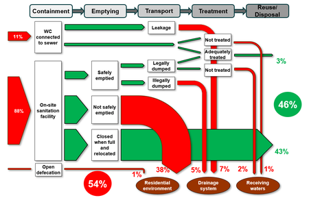
The red arrows show what’s not happening as it should be: leaking sewers, non-functional treatment plants, illegal emptiers discharging sludge in rivers, full pits that are contaminating groundwater because high fees mean they are never emptied, and waste from people who do not even have a decent toilet.
In addition to completing the diagram, the researchers (mostly WaterAid programme officers and urban specialists) produce a report that details how the city's sanitation services are functioning. Some are 'light' SFDs with very short reports; others are more comprehensive.
At WaterAid we have done almost 30 SFDs, many in 2018 through funding from GIZ, including in Bangladesh, Burkina Faso, Cambodia, Ethiopia, Nigeria and Pakistan. You can find them all on the SuSanA website. Here are a few things we have learned.
1. SFDs are easy to understand but intimidating to produce
It is easy to visualise the diagram, and the reports are incredibly helpful to understand how well a city's sanitation system is doing. Producing them is different. An SFD starts with reviewing existing data, but, very often, authorities do not have the same definition of ‘safe sanitation’ as we do, and have little good data – so we also needed meetings and visits. As Abdullah Al-Muyeed from Bangladesh put it, "Focus group discussions are critical to add texture and credibility" to our findings. In Battambang, Cambodia, visits and meetings helped the team revise the estimated percentage of safely managed excreta from 6% to 62%.
Focus group discussions are critical to add texture and credibility
Even then, some estimates are hard to compute precisely, although this is not necessarily an issue. As consultant Peter Hawkins put it when training us, "Accurate data are not always available, and so estimates are often necessary; what is more important than exactness is transparency about the source of data and the assumptions used to inform estimates – as a basis for discussion about what to correct or improve."
...what is more important than exactness is transparency about the source of data and the assumptions used to inform estimates
2. They are a great way to learn more about urban sanitation
By their nature, these reports and diagrams forced my colleagues to question their assumptions about the state of sanitation in chosen cities. As a result, we all learned that sanitation chains are more varied than we thought: open sewers leading to treatment plants; good sewers diverted for agricultural reuse (without treatment!); various sorts of pits which may or may not be leaking into the ground…
The SFD process also took us naturally to meetings with the most relevant agencies, companies and community groups, helping us develop better relationships in the process. In places where we hadn't developed urban sanitation work, it was a relatively quick way to build our knowledge and network.
3. They have many unexpected consequences
By highlighting issues in the sanitation systems, the SFDs had many effects, for instance:
• In Bilwi, Nicaragua, and in Babati, Tanzania, we have used SFDs to prepare different scenarios. These have helped authorities and donors consider alternatives to large and expensive sewers, which would serve only a handful of better-off residents.
• In Lahan, Nepal, and in Kasungu, Malawi, we have linked UK water companies with their local counterparts, and used SFDs to better understand the current sanitation situation.
• In Bangladesh, we have done SFDs in nine towns as a way to measure progress and help improvements take off, following the enactment of a national policy on faecal sludge management.
There’s more: better coordination between sanitation actors; stronger political support… more effects than I have space to quote here. In my opinion, there’s no better way to initiate urban sanitation work than by using a shit flow diagram. Tell your friends!
Read more about our urban WASH work – including links to other useful resources – in our Urban framework.
Rémi Kaupp is WaterAid UK’s Urban Sanitation and Resilience Programme Advisor. Follow him at @remkau


